writer
.projects
The original Writer app was cluttered and confusing; students and researchers struggled to find basic functions like creating new documents, adding citations and exporting their work because icons were unclear, help cues were hidden and key tasks relied on memorizing shortcuts. Interviews and usability tests confirmed that new users felt overwhelmed, frustrated and unsupported, with no guidance or way to preview formatting before exporting.
Writer was created to help writers produce polished academic work, but it soon became clear that its promise was lost in unnecessary complexity. Students and researchers were spending more time navigating the app than expressing their ideas. Basic tasks such as creating a new document, adding citations, or exporting their work were hidden behind obscure icons and shortcuts.
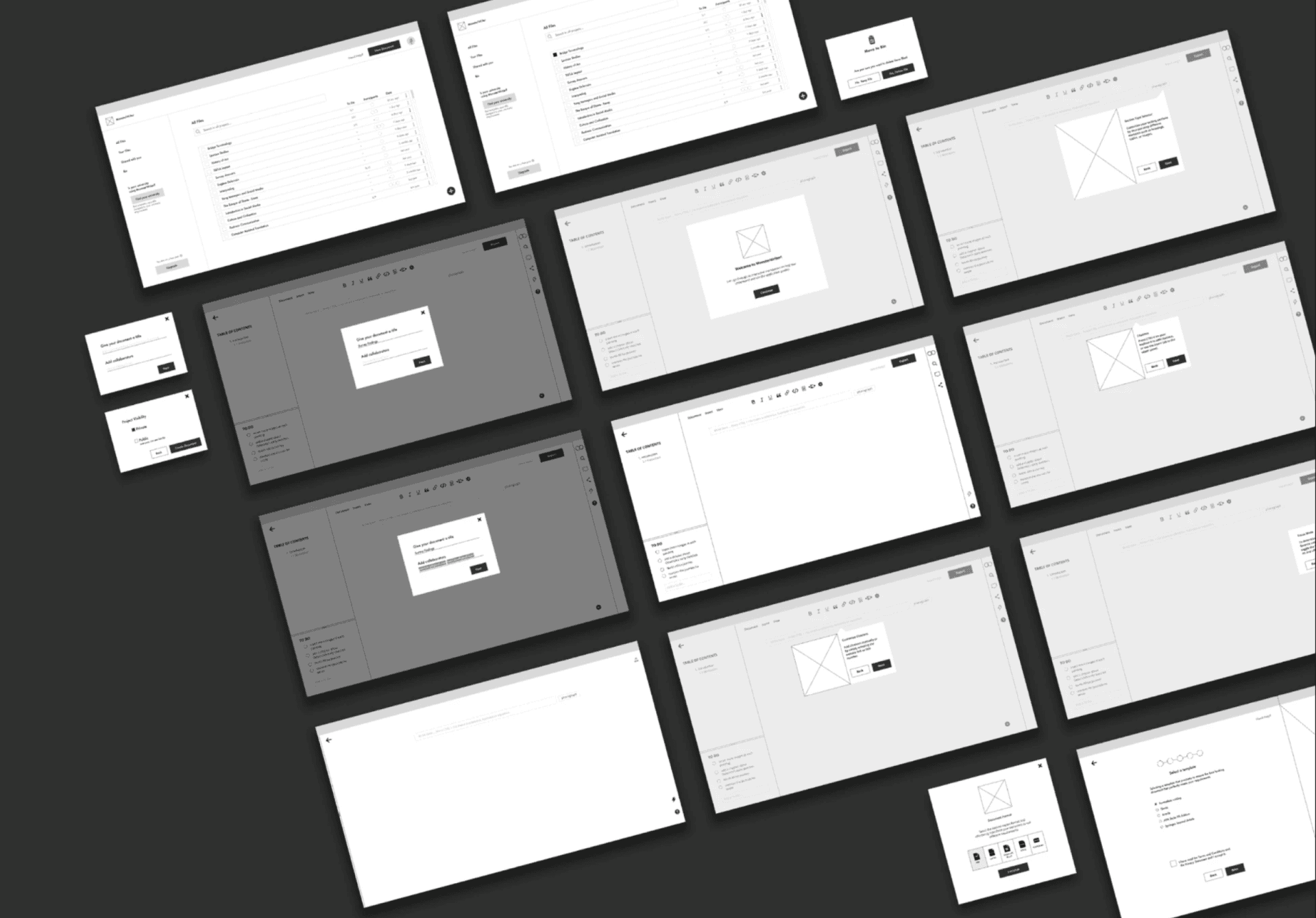
To understand these frustrations, I immersed myself in the user community. Through interviews with nine academic writers and usability tests with five participants, I heard personal stories like Patricia’s, a linguistics student racing to finish her thesis while craving more time with friends. These insights revealed a need for clarity, guidance, and compassion. We benchmarked against competitors, built personas, and mapped user journeys to illuminate pain points.
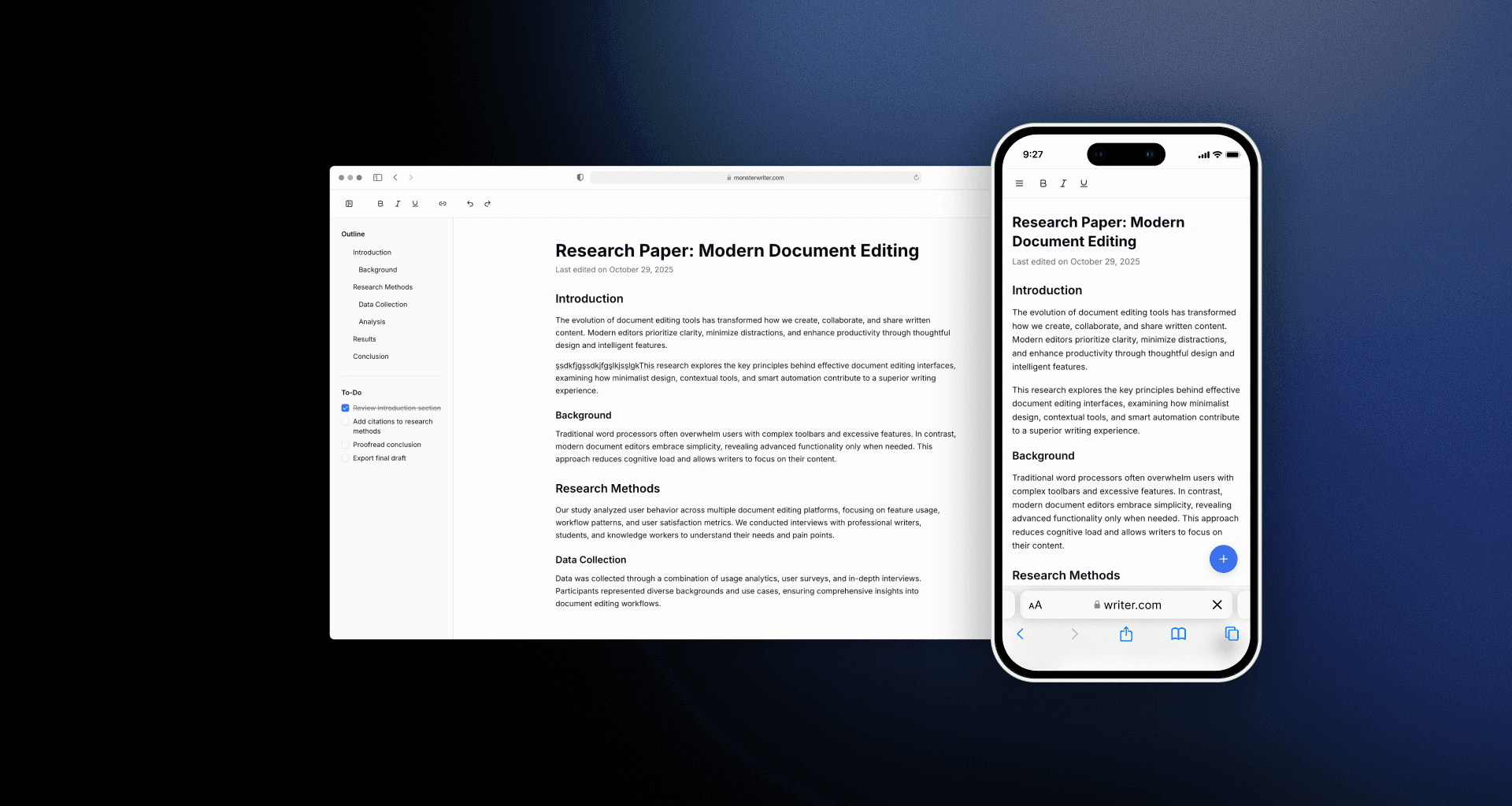
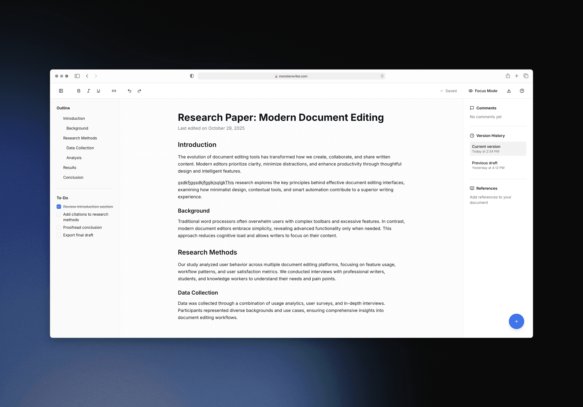
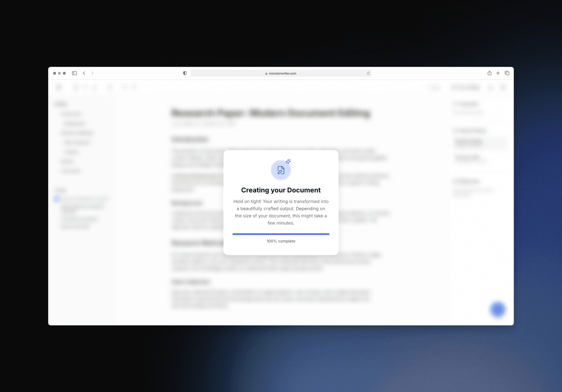
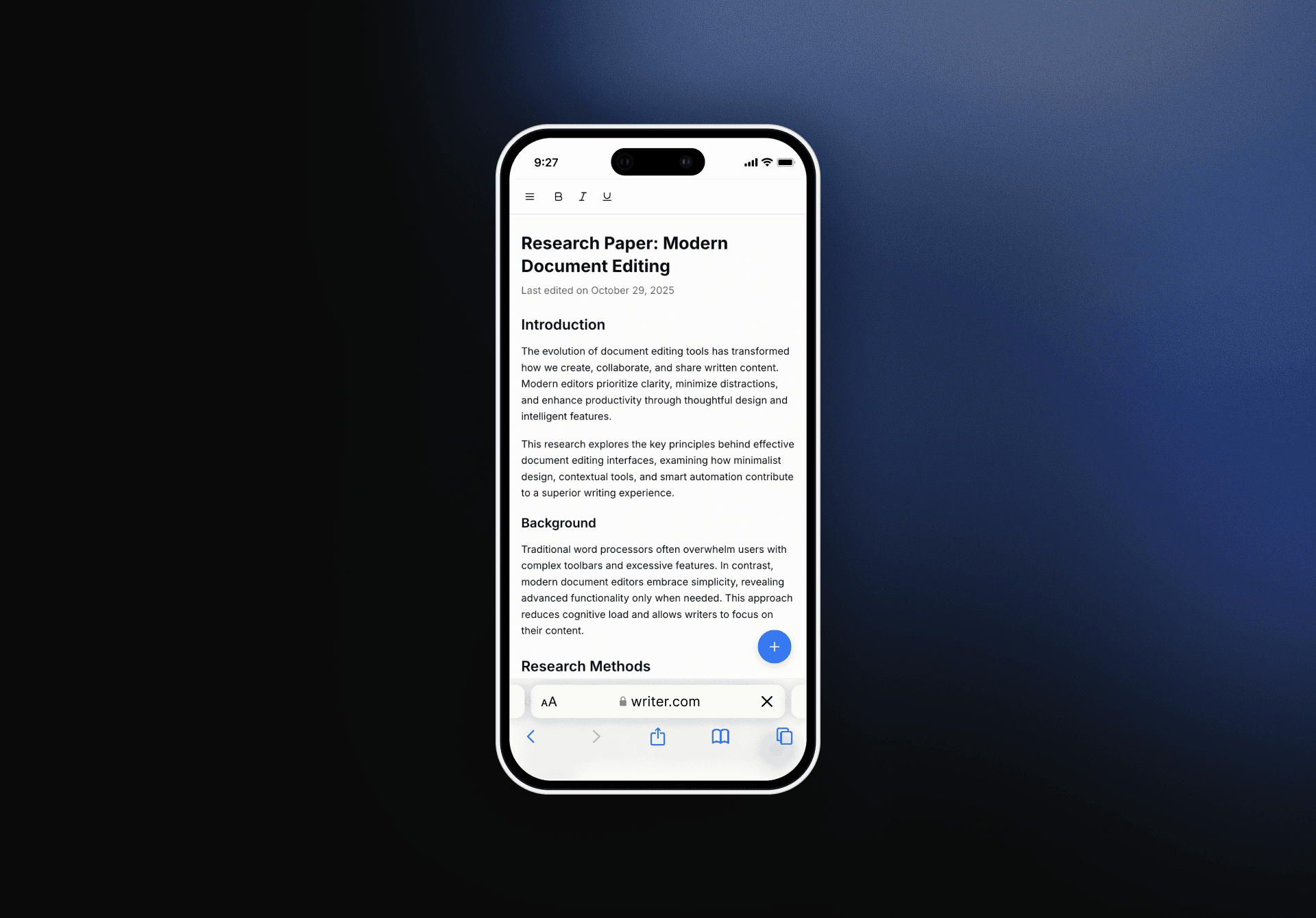
Guided by this research, we redesigned Writer from the ground up. We introduced a welcoming document explorer, a step‑by‑step onboarding experience, and intelligent citation tools that fetch references automatically. The export flow now offers a real‑time preview of typography and citation styles, and the interface uses modern typography and a clear visual hierarchy to make writing feel intuitive. Today, MonsterWriter empowers students and researchers to focus on their thoughts, confident that the tool will support them at every step.
01
02
03
see also